If you’ve visited my blog or social media pages before you may have noticed a change; yes that’s right I now have a new logo!
My logo was designed and created by one of my best friends Alice Draine who is also a very talented graphic designer. Thank You so much Alice for creating this for me!
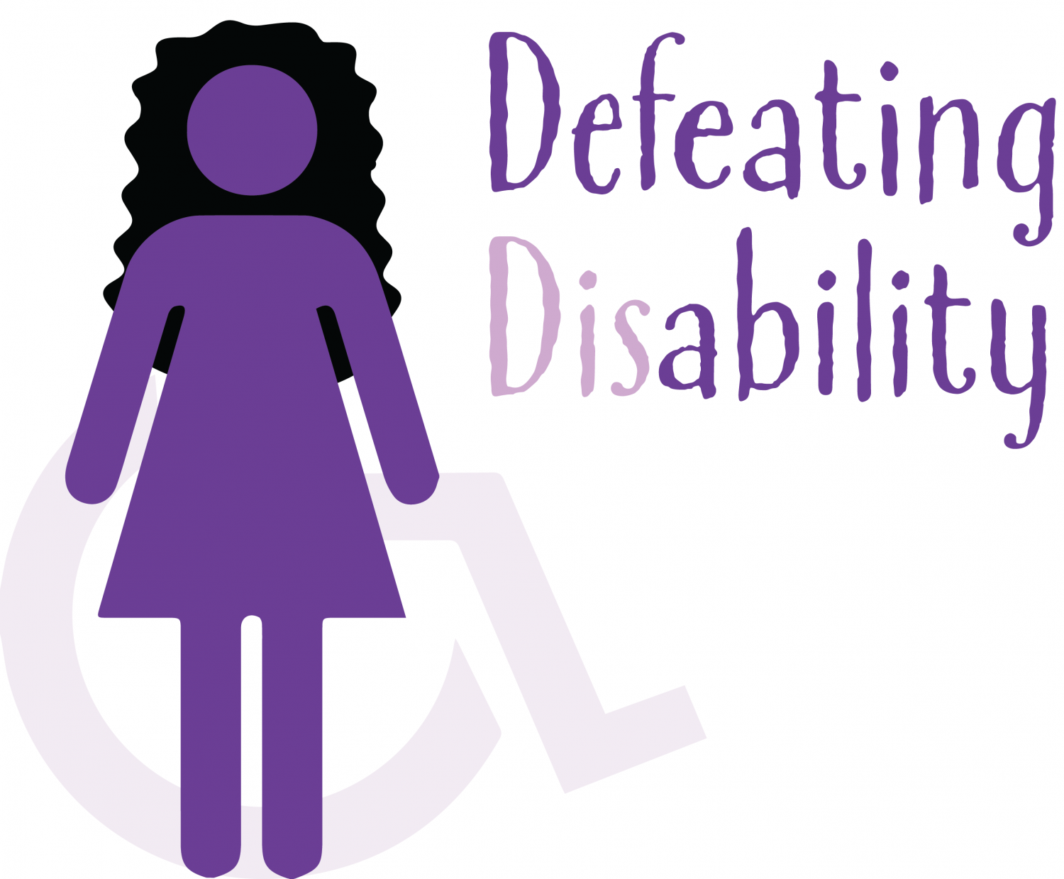
The Logo
![]()
I wanted my logo to be personal to me; my favourite colour is purple however I also wanted my logo to be different from what the disability symbol is known and recognised as which is the colour blue.
I like the way the international recognised disabled sign is covered by a figure that looks “normal”. For me this shows and helps to represent that not all disabilities, illnesses and conditions are visible. I feel that this also helps to remind people not to judge a book by its cover. I love the way the disabled symbol shows through the figure and the symbol looks lighter and darker in different lights, it has a sort of translucent effect to it.
As well as this I love the way the figure has dark curly hair like me as I am also known by my curly hair. I feel that the figure helps to bring out more about me and my personality.
I love the type face as it is fun but still easy to read. I like the way the disability symbol sort of points to the lighter coloured words. I think this really helps get my message across that not all disabilities or conditions are the same.
Using the disabled symbol in the design also helps to show what my blog is all about as I write about disability and mental health and my life living with my conditions as well as other topics too.
